
chime
Unlocking Instant Loan Capabilities
Chime is a financial technology company that offers mobile-first banking services, such as fee-free checking accounts and high-yield savings, through its partner banks. It is widely known for user-friendly features like early direct deposit access and overdraft protection.
My Role
UX Design Consultant
Team
Director of Product, Engineering Manager, Financial Analysts(4), Engineers(3)
My Responsibilities
User Research, User Interviews, User Journey, User App Flow, Wireframes, Prototyping, and User Testing
Background
The Business Problem
Chime's existing product suite: SpotMe (fee-free overdraft), MyPay (early wage access), and Credit Builder (credit-building card); was built to serve the everyday financial needs of Americans living paycheck-to-paycheck, but left a gap for members facing larger, unexpected expenses like a car repair or a bill due before payday. To address this, Chime sought to expand its portfolio with Instant Loans: small loans of up to $500, funded almost immediately after approval and repaid over roughly three months.
The User Problem
Offering this Instant Loan’s at scale required a reliable internal system for financial analysts to configure and manage loan policies. In the early day’s of launching the Instant Loans, analysts depended heavily on engineers to manually code loan policies into Chime's platform, creating bottlenecks that slowed the team's ability to respond to shifting credit conditions or launch new loan configurations. Financial analysts needed a self-service tool that gave them direct control to create, adjust, and fine-tune loan policies independently reducing engineering dependency and enabling faster, more agile decision-making.
The Solution
build a mobile-responsive platform for users to take workshops & find mentors
Throughout several meetings, I took the stakeholders through a series of exercises to determine what was needed to create a minimum viable product. This was done through the creation of personas, user stories, user journeys, and the eventual building of an initial information architecture. Once a minimum viable product was built I ran extensive user-tests with a beta-customer to gather feedback and optimize the platform.
Given the scope of what was to be created, I knew it would be critical to design a site map and page linking structures as a foundation for Kanektos functionality. I took the initiative to draft and implement a map that would enhance everyday user flows to ensure ease of use for the customer.
Customer Portal Site Map
Build a design system that scales
With a six-month alpha and eight-month beta timeline, I developed a design system to:
Streamline design management across projects
Enable rapid design replication through standardized components
Shift design focus from visual tweaking to solving complex problems
Ensure visual and functional design consistency
Reduce miscommunication and wasted design/development time
The goal was to create a robust library of components, colors, and typography that would serve as a foundational design infrastructure.

Content Cards
With the creation of workshops, clubs, and mentor marketplaces came a new content card component that needed to be successful for a variety of future content types but also surface areas, beyond just the marketplace. I worked closely with cross-functional teams, including engineering and program development, to create a global card component for our design system that could solve our current needs but scale for the future.
Optimizing User Flows
When the onboarding process was initially conceived Kanketo’s program development department wanted to collect as much information about each user as possible to help them better determin what types of workshops to offer up. With this in mind, onboarding had several steps for collecting personal/professional information.
Initial onboarding flow
Early usability testing showed clear indicators that there were too many steps between sign on and getting to the workshop marketplace so I decision was made to direct users to the workshop marketplace directly after the “Almost there” message instead of first showing them the home page. This had the added advantage of giving the users little doubt about what their first goal uplon initially signing up would be - signing up for their first workshop.
Onboarding v 2
After alpha testing it was clear that the onboarding was still too tiring for the users. While the program development team did want to collect data, their real goal was to get people signed up for their first workshop, so a decision was made to drop two more steps. After this choice, onboarding fatigue decreased significantly and the rate of signing up for an initial workshop jumped by 2x.
Final onboarding flow
The Platform

Get quick updates on platform activity
The homepage offers an overview of activities for workshops, clubs, and mentorships. Via the main navigation, users can find and join workshops or clubs, follow peers, and find mentors for career growth. They also see notifications from their groups and mentors. The sidebar provides fast access to future workshops, and the main newsfeed shows posts and suggests relevant workshops. Alpha and beta tests helped streamline and prioritize key page features to reduce clutter.
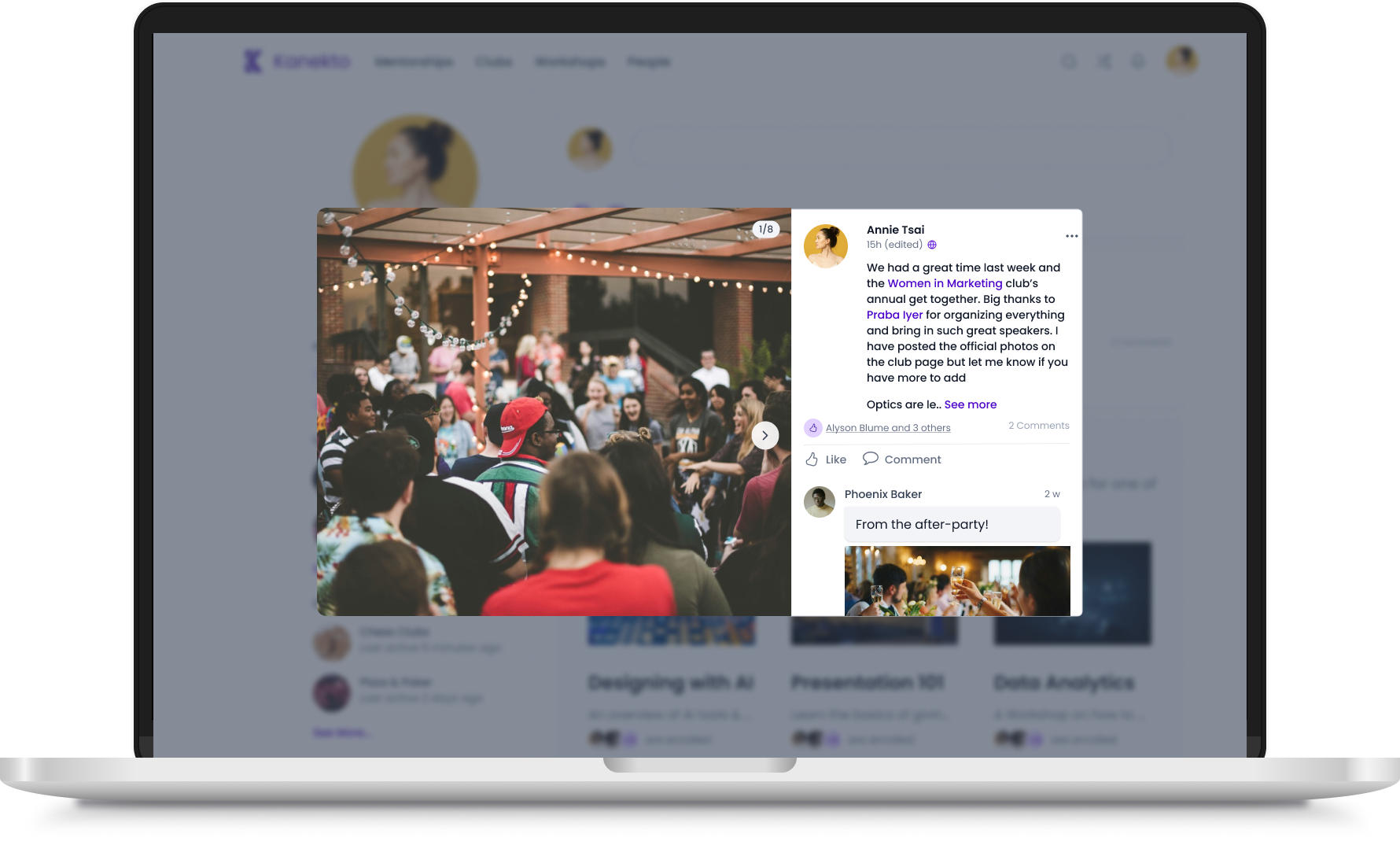
The newsfeed displays posts from their workshop and club pages which can be expanded for more detail and also serve as links to the related workshops and clubs.
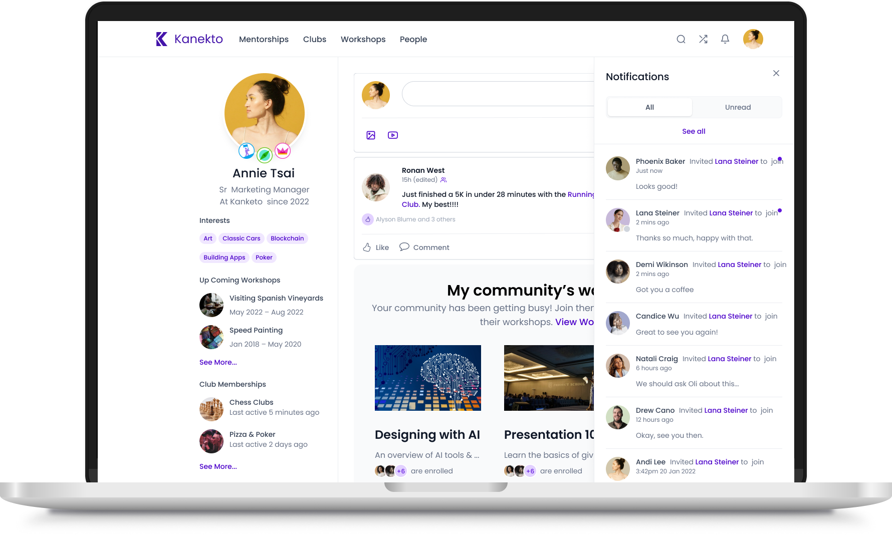
The user can see notifications about recent activity from a quick dropdown for all their workshops, clubs, and mentorships.
Create a way for users to find workshops, Match with mentors, & More
One of the most popular features of Kanekto is workshops. Each workshop was led by expert guides for small groups of individuals within a company. By having small numbers of participants, bonding between people became easier and people were more likely to participate actively. We built an easy-to-use marketplace for these workshops where people could search, sort, and filter through the wide array of offerings and preview highlights via video. They could easily see what their peers were participating in and get recommendations for workshops to take.
Sort & filter through offerings

View a video preview of workshops

Find mentors within their company to help them up-skill and build their careers

Look through coworker profiles & connect

SIGN UP FOR WORKSHOPS
Once users select a workshop, they can go to an individual workshop page to get more information about the class overall and a session-to-session agenda. From the workshop page, they can sign up, mark a workshop as a favorite to track it for the future, add the workshop to their calendar, see who else is taking a workshop, learn about the workshop guide, find related in-company clubs to join, post on discussion boards, and more.
When a user enrolls in a workshop they can add the sessions to their calendar.
Expand individual pieces of media for better viewing.
Workshop participants can communicate between sessions via a discussion board
See who else in enrolled, interested or waitlisted for a workshop
See all images and videos posted on the workshop’s discussion board.
Join clubs with co-workers on subjects related to the workshop or start their own.
Create individual profile pages
Each user gets a profile page which they can customize with information about themselves including their title, years at their company, office location, interests, profile & header pictures, and more. The page is a central place for them to track what workshops they participate in, club memberships, mentorships taken/offered, and who within their company they follow. They can also earn badges to put around their profile by guiding a workshop, starting a professional club, or mentoring someone.
Edit personal info, privacy, & communication settings
View club memberships
Upload photos for use as avatar and header images
See current mentorship the user has signed up to take
Edit, crop, and center profile and header images for profile page
Track who is participating in mentorships the user has offered.
Video conference portal for workshop sessions
As the vast majority of workshops were designed to be virtual so employees from different office locations could attend at the same time, I designed a video conference software portal for Kanekto.
Staging screen. Before entering the primary video conference, the user sees a staging screen where they can check their video and audio settings.
Breakout rooms could be created by the workshop guide either automatically or manually.
chat dialoge boxes were added to allow users more way to communicate, share links, and even documents during a session.
Various settings can be altered by the user from audio, to video, to image background.
Breakout rooms allowed for better interaction between individuals. From a breakout room, suer could go back to the main room as well.
At the end of each session, a user is shown a final requesting feedback on the workshop and guide before being routed back to the workshop’s page.
Outcome
“I wish our platform looked like this”
Results
42% of beta company employees onboarded successfully in the first 48 hrs
56% signed up for an initial workshop during onboarding
A Further 18% signed up in the first week
Kanekto was able to launch the the beta product with their first live and paying customers on time. Initial buzz from those involved was very positive. Initial success lead to further development of new workshop products to further grow the platform

“I count Alyson amongst the handful of "super stars" that have worked for me over my 35 year career. Alyson joined Kanekto to lead UX/UI design and very quickly grew to also lead Product. Customers and prospects often compliment Kanekto on the simplicity and beauty of our UI/UX and product features. Alyson was deeply respected and liked by everyone in the company, most especially our engineers. She is a rare combination of high IQ, high EQ and a admirable moral compass. I recommend Alyson in the highest terms.”
Ujjal Kohli, CEO